Posted on

Proceed with Caution

Searching for Answers
                      Searching for Answers

There is an awful lot of information out there in cyber space. I’ve said it before, not all of it is accurate and honest. Some of it is just outright garbage.  Anyone can publish anything about whatever. Don’t misunderstand me, most of it is fabulous and has greatly supported my most recent obsession with nail art. I recently read some information on a sewing forum that has led to the following.

Just because someone published a blog or a video, doesn’t mean it will work that way for everyone. This is especially true in the sewing world. Possibly other worlds as well, but this is the world I’m comfortable in. There are too many factors that contribute to, “it worked for them, why doesn’t it work for me?” Those variables include, weather, needles, thread, thread color, fabric, prewashed or not, and on and on. Let’s look at some of these.

Weather: I live in the Southwest of the United States. Most of the time it is very dry here. When it does rain, I find that I need to adjust settings on my machine to get the same stitches I get when it doesn’t. I’m sure the same holds for when it gets super cold, but I haven’t personally experienced this. Obviously, what I do may not work for someone who lives in Minnesota.

Needles: I am the first one to ask, “did you change your needle?” and then not do it myself. Yes, sometimes a brand new needle can have burs, etc. Make sure you are using the right needle for the fabric. Click here for more info on needles.

Thread: I would not have believed that thread color could make a difference, until it happened to me. I changed thread color in the middle of a project. I did not change the bobbin, only the top thread, same brand, same line. My stitches were not as perfect. Then there are different manufacturers. I have 3 Berninas. Only one of them likes a very popular thread brand.

Are you with me now? You are the only expert on your machine and all its  nuances. No one sews like you; the combination of your hand weight on the fabric and speed. Your environment.

The only suggestion I can offer is to use what you read/see as a jumping off point. Most importantly, don’t be afraid to play with the knobs on your machine; most of them have a way to easily go back to the default settings.  Once you get a setting you like for a type of project, write it down. Needle, thread, settings, fabric, etc. This is no guarantee it will work exactly the same way the next time, but it’s a great place to start.

Lastly: for a lot of people, sewing is a hobby (“an activity done regularly in one’s leisure time for pleasure”). Pleasure should be your guideline. Have fun, experiment, stretch yourself creatively, and enjoy the process. By all mean, scour the internet for information, just be open to what you find.

**I generally like to go to manufactures websites for information on their products. I really like Superior Threads education section of their site. This is definitely a great place to start.

Posted on

Jimmy’s Journey

Jimmys Journey

I like my quilts to mean something. This one is for my brother. He recently came to visit and helped me clean out my garage. This is my Thank You to him. Jim loves to drive and takes road trips on a regular basis, even just for a day. He hates to drive on interstates and is much more likely to spend 8 hours on the road getting to a destination where most of us would spend less than 4. Makes him happy; I’m good with that. I wanted to make something that would reflect that sense of wandering. The printed fabric represents the roads. The quilting is where my brother drives. The backing is a blue batik that reminds me of Hawaii. It also happens to be where Jim goes for vacation annually. I think all in all, it is absolutely perfect!

I found this pattern in the Moda Bake Shop. Mine is 64″ x 80″. It was labeled easy, so I knew I could get it done quickly.

I thought I had a color palette all picked out, but once I started auditioning fabrics, I started second guessing myself. As you can see from the photos below, taking fabrics out and laying them together will often give you the answer you’ve been agonizing over.

Background Choices 1 & 2
Background Choice 3
Background Choice 3


I didn’t like the look of the printed fabrics  on both of the background choices (1&2) on the left, but the one on the right was the perfect color for the jelly roll I had picked up. Plus his car is orange, so the decision was actually quite simple.

I don’t always follow directions to the T and instead of using a second jelly roll for the background, I cut my own. I chose sewing the strips together and then cutting them down instead of cutting first. Next time, I’ll try to remember to do the math first, as I think I had enough left to piece a binding with the printed fabric. Unfortunately, they were all cut up by the time I thought of that. Putting the top together was a snap and was done in less than a week.


piece 1piece 2

The blocks are coming together!

Quilting Process

I used QuiltMotion by Grace for Bernina for the quilting with a curly q pantograph.

I’ve yet to put it in the mail, so I hope he doesn’t see this.

Posted on

Do the Math……PLEASE

calculatorNot all things, like patterns, are created equal. (yes, that could be a math pun, but it’s not.) This is unfortunate. What really frustrates me is when I get into a pattern and things just don’t add up. No matter how many times I do the math, unfinished blocks minus seam allowances do not equal what the pattern says it should. Can’t someone take the time to check this out before it goes to press?

I will admit that sometimes striving for perfection gets the better of me. I tell my students that their quilts don’t need to be perfect. I honestly believe this to be true. The problem is when the pattern isn’t perfect, and it should be.

Good designers have others test their patterns for them. They use the same image size for the applique layout AND the applique template. They make sure that the finished block size times the number of blocks equals the border length. They do the math.

Great designers take the average quilter’s checkbook/credit card into consideration as well. A little math goes a long way when cutting fabric. Fabric companies often given designers free fabric.  This way the consumer can see the fabric in a quilt, which not only sells the fabric, its sell the pattern as well. Think of the times you have gone into a quilt shop and bought a pattern and fabric because you have seen it hanging on the wall. Sorry, back to the math. If you don’t have to pay for your fabric, you probably don’t really care how much is wasted. I do. I don’t collect fabric and I don’t want to start.

Sew, what do you do?  Support the designers who create patterns that go together nicely. Support designers who engineer cutting methods that don’t waste fabric. If the mood strikes you, contact the ones who don’t and let them know how you feel. Maybe all they need is a calculator.


Posted on

December: Classy is Always in Style

20141217_144728
Classy is Always in Style

The final Christmas gift.

I love a simple pattern that packs a lot of punch. My daughter loves classic designs and hounds tooth is one of her favorites. I took her shopping last spring to buy some fabric. You probably can’t tell in the photo, but the white is a white on white hounds tooth. Even though she had seen the fabric, I kept the project hidden until she opened it.

Most of the patterns I found wasted a lot of fabric, and I mean A LOT OF FABRIC! I knew there had to be a better way.

Missouri Star Quilts to the rescue. I love how Jenny Doan breaks down a pattern and makes it simple. Her Hounds Tooth Quilt was exactly what I was looking for. Simple, quick, and very little waste. Even if I tried, I couldn’t improve on this method.

The quilting is boring; in the ditch with light grey thread. I used aurifil thread and I should have used something thinner. Do as I teach, not as I do!  OOPS. I know a lot of quilters who cover up mistakes with fabric markers; I know….brilliant! I grabbed a black fabric pen and went to work covering up those few lines of stitching that didn’t exactly go where I wanted them to.  A pressing to set the ink, a label and off it went to be wrapped.

My daughter loves it! I do too.

Posted on

November 2nd Project: Microwave Bowl Pot Holders

20141229_145226

In my excitement to get these wrapped, I forgot to take pictures. So this is one I made for myself. It’s a little smaller than I like, but you get the idea.  I plan on making another one for me.  These little handy pot holders for your microwave make great gifts. There are tutorials all over the internet on how to make them.  They are machine washer and dryer friendly. Basically you set your bowl in the holder, pop it in the microwave, and use the corners to lift your now hot bowl out of the oven. **Contents will be hot, so use caution.** If you stop reading at this point, please note; YOU MUST USE 100% COTTON PRODUCTS WHEN MAKING THESE BOWLS. I have heard of fires starting because someone used what they thought was cotton batting or polyester thread.

I purchased a Layer Cake (a package of 42 pre-cut 10″ squares) knowing I wanted to make a bunch of these and it was faster than cutting the squares myself. I used a product called Warm and Plush for the batting and cut them into 10″ squares. That’s when my mind went off again. There had to be a better way to stitch each square corner to corner, but with 10″, simply marking a center line on my sewing surface wouldn’t work. Then I came up with template. Basically, I took a 10″ square piece of construction paper (cause I had some) and cut it in half on the diagonal. Then I trimmed a quarter inch off of that. I clipped the paper to my fabric/batting layer and stitched along the edge with a quarter inch foot.

Template for corner to corner


Next were the darts, and my mind went thinking again. This time I used cardboard and marked the top and the side with my dart markings. Cut that off, and then trimmed off a quarter of an inch.  I just held the template in place and stitched my darts.

Dart template


I could have just as easily marked my lines, but each bowl has 4 lines of stitching and 8 darts. Multiply that by 10+, well you get the idea. I normally use my #10 foot on my Bernina for top stitching, but I found the #20 foot seemed to work better on the bulk. I was able to butt the fabric against the inside of the right toe and moved my needle to the left.

Everyone on my list got one.


Posted on

October: Something For Everyone

Something For Everyone

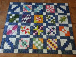
I started this quilt in January of 2012. It was a block of the month at a local shop. You pay a minimal amount to join and then if you bring in the finished block form the previous month, the fabric for the next block is free. Then there’s no incentive to get the 12th block done, let alone the top finished.  Let me just say, I’m not a fan of most blocks of the month. There are usually way too many colors and not enough consistency for my taste. This quilt is no different. That being said, I do them to learn and hone my craft.

The pattern called for the blocks to surround a large colorful piece made of 3″ blocks.  I made an error in color choice and didn’t like the way it looked. So I will save that center for another project.

Once I started laying out the blocks, it became obvious who would receive it. A family with 3 small children who ALWAYS fight about color. Each has a favorite color and the others don’t want anything to do with anything that is in their sibling’s favorite color.

At first I was going to do some complicated quilting on the frame using QuiltMotion (a computer program for quilting.) The plan was a block motif for each block and then something different for the sashing and cornerstone  pieces. Then reality kicked in and I quilted it with a simple pantograph. I’ll save the complicated quilting for another time.

One major Christmas gift ready to wrap!


Posted on

My Kind of Town

My Sewing Machine Paints too!

DSC02319


I’ll admit that I am spoiled. I own a Bernina 830LE. It is an amazing sewing and embroidery machine. I also have digitizing, cutwork and painting software. Paint you say? Yes. My sewing machine paints. It is a marvelous thing. I had been looking for a piece of Chicago artwork to hang in my desert home for quite a while. I love Chicago, but not the weather. The skyline is like no other and to have a reminder of my birthplace is something that’s been missing.

Then one day, I ran across an embroidery design called  Cityscapess. . BINGO!  I could embroider Chicago on linen and frame it. NO WAIT, I could paint it, on glass, on a shadowbox…..my mind was exploding.

First I had to convert the embroidery design to a PaintWork design. PaintWork is a module of DesingWorks Software from Bernina. It is really fun and allows you to do so much more than sew with your computerized machine.  Converting the design was super easy and quick. Now, how to get it centered on the glass. Since I was using glass ink pens, there was no room for error. Light Bulb. Stick with me, this is genius.  Whoa, if I painted a mirrored image, I could paint it on the inside of the glass. Quick trip back to the software.

I use stitched placement lines when embroidering all the time, why not do the same thing here? I digitized a rectangle the exact size of the glass.  I hooped sticky back water soluble stabilizer and stitched out the rectangle.  The stitches perforated the paper that covers the sticky part so I was able to remove only the paper that was the same size as the glass. Because my machine automatically centers every design, both the rectangle and the skyline design would be centered with each other.

Paper removed, ready to place glass.

I carefully placed the glass on the rectangle. When I say carefully, I mean protect yourself. I used old diapers to protect my hands from getting cut. I held it down with painter’s tape for extra security. I taped freezer paper over the glass so I could adjust the height of the pen. I tried using aluminum foil, but couldn’t get it smooth. If the pen was too low then the lines would be too thick.  Too high and it wouldn’t draw a continuous line. When painting on fabric, if the pen is too high you can lower it and go back; not so much with glass. Everything had to be just right before I started painting on the glass. Light bulb again. I have a tendency to over think things, but this time it paid off.  I was afraid to use regular paper for fear the paint would bleed through. The freezer paper was moving just a little bit. Glad® Press “N Seal® was perfect. It stuck to the glass so it didn’t move and came off like a dream.   Once I had my settings adjusted, I removed the Press ‘N Seal® and let it go.

All ready to test height of pen

When my machine, that is so awesome it paints too, stopped, I fought the urge to remove the glass right away and admire my work. I let it sit to make sure the paint was dry. The glass came off the stabilizer very easily, but I used the cloth diapers again. This not only protected my hands, it prevented finger prints from jumping onto the glass. You can easily remove any sticky residue with glass cleaner. I had very little to clean off. Then I popped (ok, carefully placed) it into the frame. I love the way the buildings cast a shadow in the back of the frame. There is a perfect place in a hallway where the light hits it just right and I can see it daily. Plus, with the paint on the inside, I can clean the frame without worrying the design will come off.

Design finished; waiting to dry.

Note: When buying shadowboxes for this technique, look carefully for one where the glass comes out easily.  The first time I did this, I broke the glass removing it.  The glass was glued in and although one side popped out easily, the other did not. Also, please be careful when handling the glass. It is a lot sharper than you would think. Since I used a black frame, the background was black as well. I used a piece of textured white paper to create the contrast. A light tan would have worked and given it an old world charm, but I like the clean look of the white background and black paint.

So what is next? I think anything would work. You wouldn’t have to use a shadowbox. Imagine a design collection, individually painted and framed, finding a home on a lonely wall.  Or the birth details painted on the glass over a baby’s first picture. A special date floating over a picture of the event. If it fits in your hoop, why not?

Have fun playing and let me know what you create.